Homea – A piece of peace
–
Brand Identity Development
Homea is a furniture design company, specializing in building and creating wardrobe, kitchen, and vanity. Every product is made of the finest materials to deliver high quality living into your space. Homea’s products transform every living space into a comfortable and pleasant place. With the range of quality designs, Homea is set on creating an identity that would capture the public’s interest.
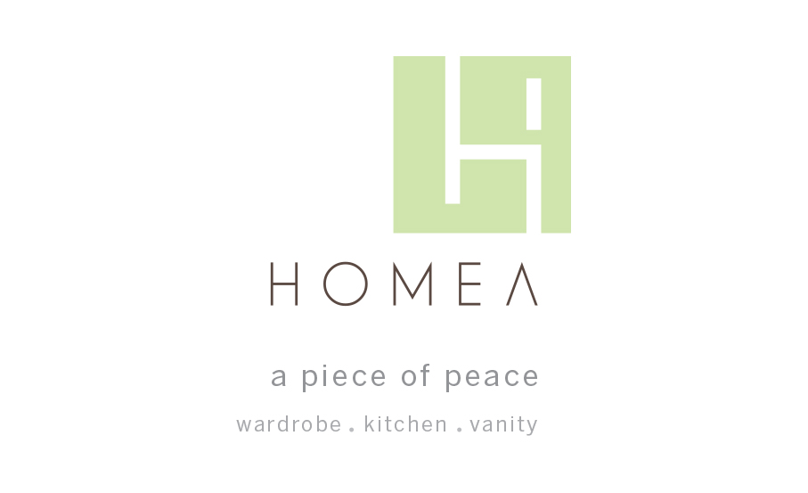
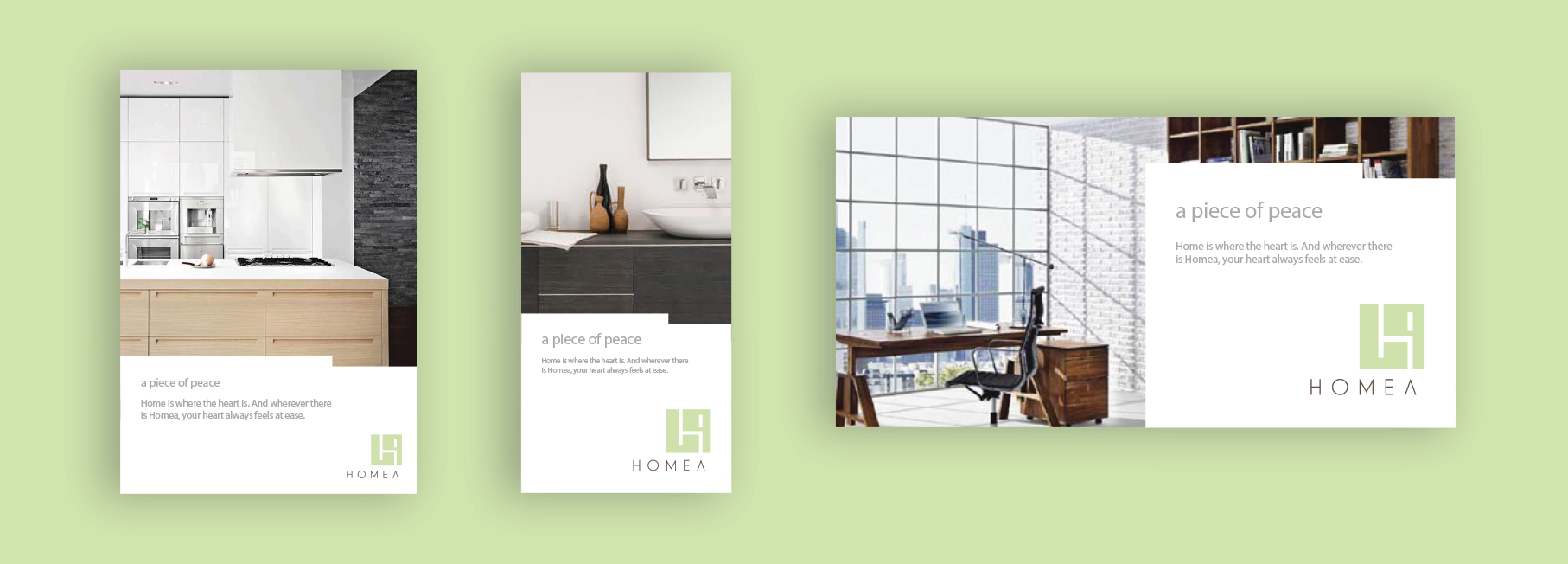
Home is where the heart is. Whenever there is Homea, your heart will always feel at ease. Using this standpoint as our foundation in developing the branding, we crafted the new tagline, “a piece of peace” to further making the point that Homea’s pieces will bring peacefulness of home to every living space.
The logo is derived from the silhouette of a chair made to resemble the letter ‘H’ as in ‘Homea’. In all aspects, we added a touch of green and brown which represent the feeling of peace radiated from every one of Homea’s designs. The primary use for the Homea logo is the two-color version, but we also prepared few adaptations for the full-color reverse logo, grayscale logo, and grayscale reverse logo. We presented our logo creation in detail as a guideline – down to the color used for the background, white spacing, incorrect usage, font, and positioning.
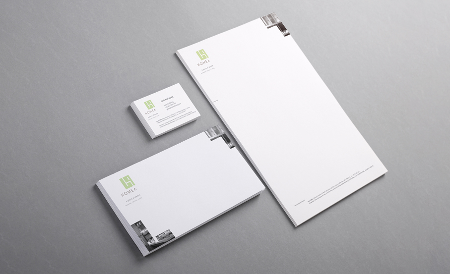
Apart from tagline and logo, we also made Homea’s official stationeries in the form of name card, envelope, and letterhead. The new logo and tagline take the corner of each stationery with the grayscale accent on the other corner, creating a beautiful and minimalistic design that suits Homea’s new brand.


